

Mobile app onboarding redesign case study
An instrumented onboarding rebuild lifted a mobile app's sign-up completion from 48 to 70 per 100, and the same measurement showed where the real bottleneck was.
 Case study
On this page12 sections
- Measure the funnel before you touch it
- What was slowing people down
- What changed
- The results on iOS
- What the same measurement ruled out on Android
- How the team worked
- What we watch next
- Frequently asked questions
- What is a good app onboarding completion rate?
- How do you know an onboarding redesign actually worked?
- How do you reduce sign-up drop-off?
- Does simplifying onboarding always improve retention?
Before rebuilding a subscription app's sign-up flow, we instrumented the old one, so we could tell whether the rebuild created real value or just looked different. It did: on iOS, sign-up completion rose from 48 to 70 of every 100 people who started. The more useful part is how we knew, and what the same measurement revealed about a problem the redesign was never going to fix.
Measure the funnel before you touch it
A redesign is easy to ship and hard to defend. Change a flow, watch the numbers move, and you still cannot say how much the change was worth, or whether it was the change at all, unless you measured the starting point the same way.
So the work started before any screen was redrawn. The method is simple to name and easy to skip: instrument the current flow, read where people leave, rebuild against that, then measure the new flow the same way. We added Firebase events across the existing sign-up flow to map where people dropped off, kept that legacy flow live and collecting data while the new one was built, and by launch had a clean before, measured exactly how we would measure the after.
That sequence is what let us answer the only question the client actually cared about: was this investment worth making.
What was slowing people down
The old sign-up flow asked for too much, too early. Three points did most of the damage. Screens that collected personal details did not adapt well to every device, so they were harder to complete than they looked. Photo upload required four images before anyone could continue. And location was entered by hand, which sounds minor until a mistyped entry triggers an automatic ban and the user is gone before they ever see the product.
None of these is a single person's mistake. They are the kind of friction that accumulates across a flow when no one is measuring where people leave.
What changed
The rebuild was deliberately small and reversible, aimed at the points the data flagged. We reduced the required steps and let people skip and finish later. Photo upload went from four images to two. Automatic location detection replaced the manual entry that was getting people banned. And a paywall was placed at the end of the flow, so the upgrade offer arrives after the experience is already easier, not before.
The results on iOS
Measured from 15 September to 1 October against the prior week, with Google Analytics and App Store Connect as the source, sign-up completion rose from 48 to 70 of every 100 people who started. The old and new flows are not measured identically, so we read this as a strong directional gain rather than a precise constant. First-week sign-ups roughly doubled, from 484 to 918 people, and new accounts per 100 downloads rose from 42 to 69. Daily revenue rose alongside completion, from about 150 to 181 US dollars, close to 21 percent, and next-day return rose from 28 to 33 of every 100.
One number did not improve: seven-day usage held roughly flat, 8.3 to 7.7 of every 100. The window here is short, a single week against the week before, so these are early signals rather than settled results. They point clearly in one direction, and they name the next problem honestly: we got better at bringing people in, not yet at keeping them for the long run.
What the same measurement ruled out on Android
The identical rigor, applied to Android through Google Play Console, told a different and more useful story. There, the flow was not the bottleneck.
Comparing 11 September to 1 October against the prior period, on daily averages because the two windows differ in length: store listing visitors fell about 16 percent, from 620 to 521 a day, and first opens fell about 14 percent. Revenue held steady, down 2.3 percent, from 258.82 to 252.95 US dollars a day. Next-day return held around 37 percent and seven-day retention around 15.7 percent, essentially unchanged.
Read together: Android keeps and monetizes the people who arrive. Fewer are arriving. The lever is acquisition, not the sign-up flow. One caveat we kept visible rather than hid: a spike of 702 first opens on 20 August, against a normal of around 250, inflates the earlier period and makes the traffic drop look larger than the steady state.
That is the quiet value of measuring first. It does not only tell you what worked. It tells you where effort would have been wasted, so the next sprint is aimed at the real constraint instead of the obvious one. Before recommending more design, more engineering, or more acquisition spend, we found where the funnel was actually breaking, and it was not the same place on both platforms.
How the team worked
One detail matters more than the usual team description. Recovering analytics was not in the original brief. The team built it in anyway, because without it there was no way to tell the client whether the investment was paying off. That instinct, to put measurement in place before anyone asks for it, is what separated this from a redesign done on faith. It was one integrated team throughout, design, development and project management working directly with the client's product owner, not a relay of handoffs.
What we watch next
Success surfaced its own next problem, which is usually how this goes. As volume rose, crashes rose with it, from about 7.4 to 9.4 a day, with one day reaching 52. The team's read is that higher usage is now reaching old, rarely-visited parts of the app. Solving acquisition and onboarding on iOS pushed the constraint to stability and long-term retention. That is the next piece of the same system, managed continuously, not declared solved.
Frequently asked questions
What is a good app onboarding completion rate?
There is no universal benchmark worth chasing. Track your own funnel, find the single biggest drop-off step, and measure whether a change actually moves completion. In the work above, iOS completion moved from 48 to 70 of every 100 people who started.
How do you know an onboarding redesign actually worked?
Measure the old flow before you change it. Instrument the funnel, keep the legacy version collecting data while the new one is built, then measure the new flow the same way. Without a like-for-like before, you cannot separate the redesign from everything else that moved.
How do you reduce sign-up drop-off?
Remove steps and fields that are not essential, and fix the specific friction the data flags, not the friction you assume. Here that meant fewer required steps, photo upload cut from four images to two, and automatic location detection in place of manual entry that was getting people banned.
Does simplifying onboarding always improve retention?
No. Better acquisition and completion do not guarantee people stay. In this case seven-day usage held roughly flat even as completion rose, which named the next problem to solve rather than hiding it. Measure both.
Find your real bottleneck. We instrument the flow first, so you fix what is actually broken, not what looks broken. See how NetForemost approaches product design and UX.
Keep reading
All resources Case study
Health and Wellness Mobile App Development Case Study
When a client's input slows down in the middle of a project, delivery does not have to stall.
 Case study
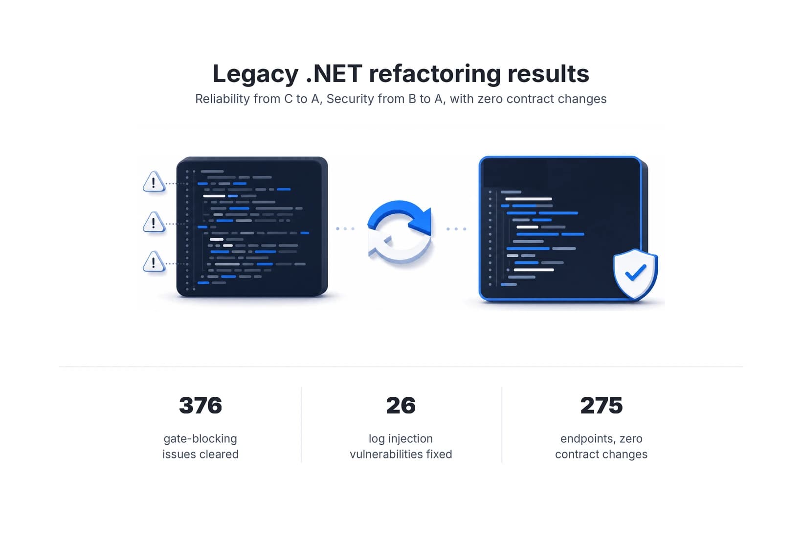
Legacy code refactoring on a live .NET 8 API, with zero contract changes
How AI-native development cleared a blocking SonarQube quality gate and 26 log injection vulnerabilities in a production .NET 8 API, with zero contract changes across all 275 endpoints.
 Case study
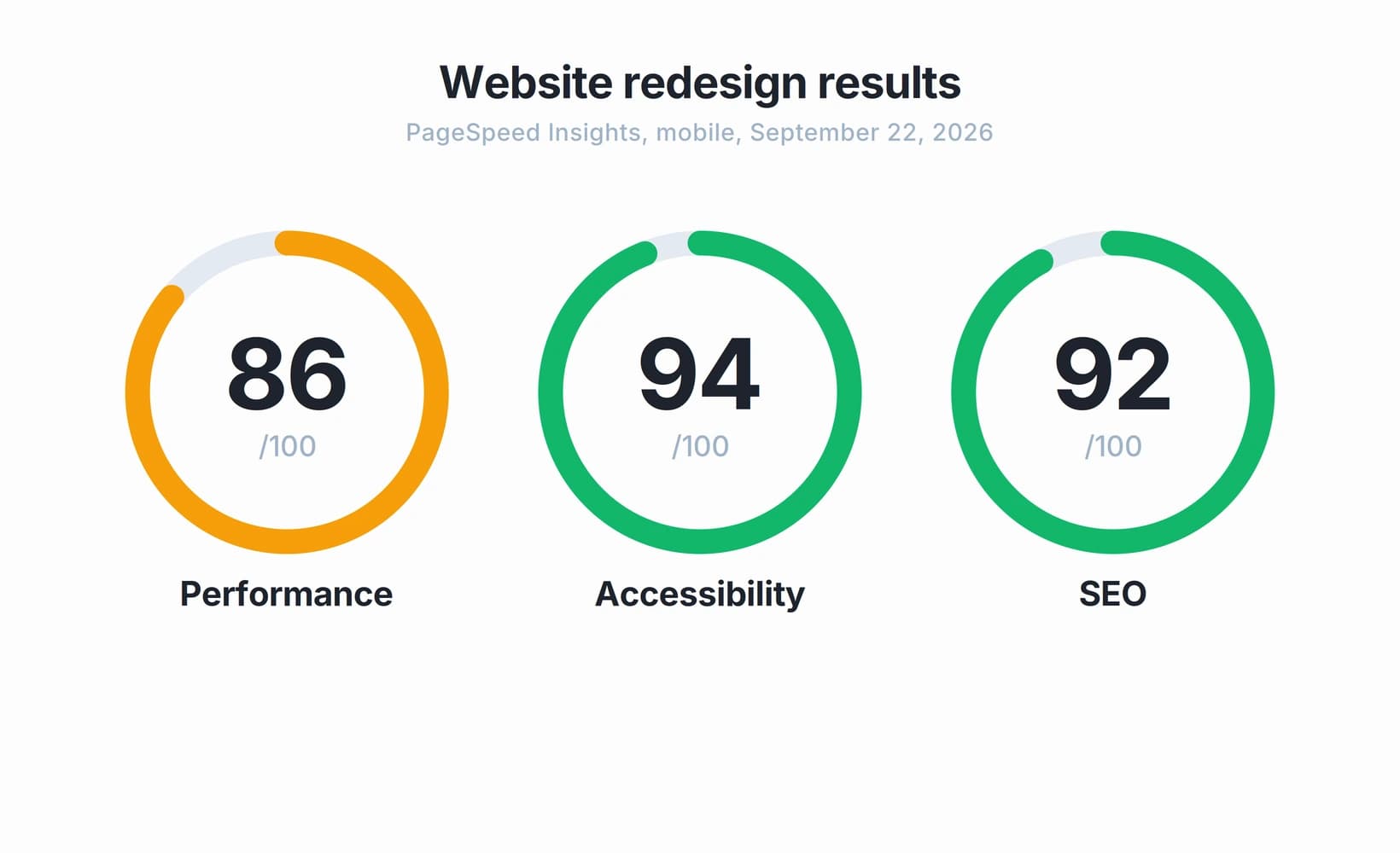
How a B2B website redesign reached strong mobile scores in 2 to 3 weeks
A B2B technology company needed to redesign and relaunch its website in two to three weeks. Here's how NetForemost took the project from design through production while measuring performance, accessibility and SEO on mobile.