

CSS Essentials: How to Perfectly Use rem, em, or px
Master px, em, and rem units in CSS for precise, flexible, and responsive designs. Discover the best use cases for each unit in your projects.
 Guide
GuideOn this page6 sections
When working with CSS, choosing the right unit for font sizes, margins, paddings, and other layout elements is crucial for responsive, scalable design. Three common units—rem, em, and px—each have unique properties and purposes. Here, we’ll dive into what makes each unit different and when to use them.
1. What is px?
The px unit, short for pixel, is an absolute unit that represents a fixed size on the screen. When you set an element’s size in pixels, it remains consistent across different devices, meaning it does not scale relative to any other factors like parent elements or screen size.
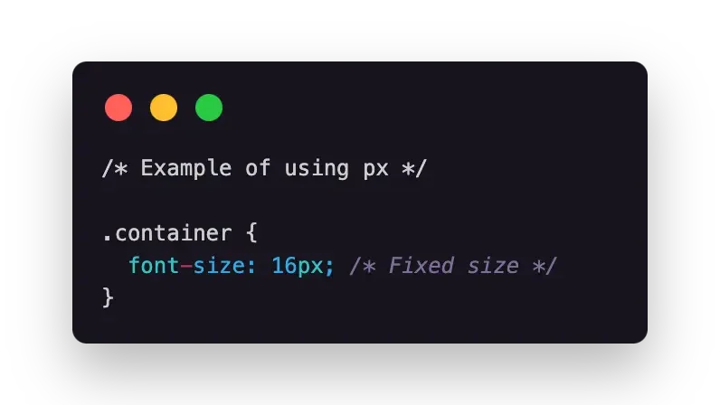
Using pixels can be ideal for small, detailed adjustments where absolute precision is needed. However, pixels don’t scale, making them less suitable for fully responsive designs.
2. What is em?
The em unit is a relative unit based on the font size of the element’s parent. It is flexible and changes according to the inherited font size from the parent element. This means that if you set an element’s font size using em, its size will be a multiple of the parent’s font size.
For example, if the parent element has a font size of 16px, setting a child element’s font size to 1.5em will make it 24px (16px x 1.5).
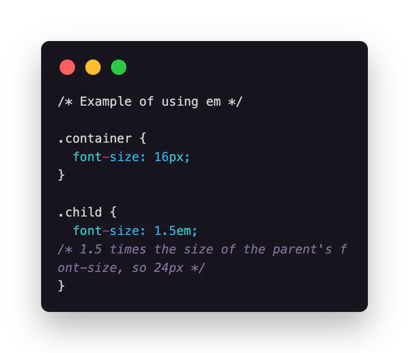
The em unit is ideal for creating flexible designs but can become confusing if nested, as each child’s size depends on its parent. This nesting can lead to “compounding,” where font sizes increase unexpectedly.
3. What is rem?
The rem unit stands for “root em” and is also a relative unit, but it’s based on the font size of the root element (html), not the parent. This makes it simpler and more predictable for responsive design, as all elements using rem refer to the same base font size regardless of nesting.
By default, most browsers set the root (html) font size to 16px. Therefore, 1rem is equal to 16px unless the root font size is changed.
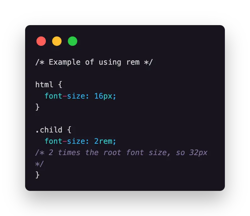
Using rem is generally recommended for scalable layouts, as it ensures consistent sizing throughout the page. Adjusting the root font size allows you to scale the entire design, making it a preferred choice for responsive typography.
When to Use px, em, and rem
- Use px when you need absolute precision for small elements or when working with graphics that require exact pixel alignment.
- Use em when you want size adjustments to cascade relative to a parent container. It’s ideal for flexible components that should adapt to different parent font sizes.
- Use rem when you want consistent sizing across the page. It’s best for scalable, responsive typography and layout elements that need to maintain proportional sizes.
Code Comparison Example
To help clarify, here’s an example of how px, em, and rem units impact layout. In this example, we’ll create a container with nested elements, each using a different unit:
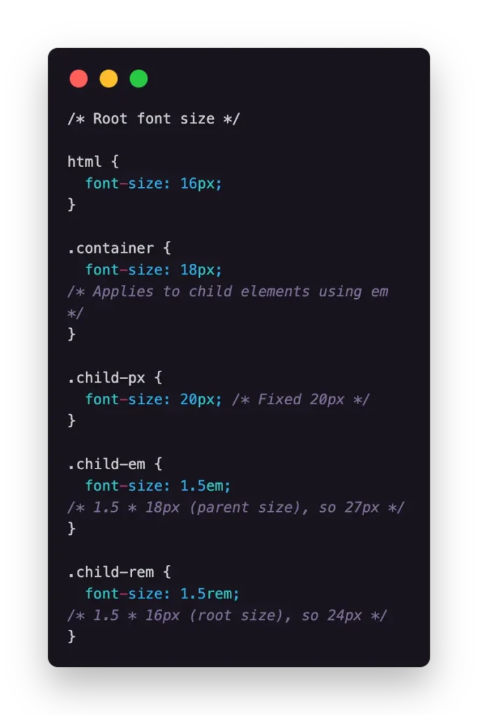
In this example:
- .child-px has a font size of 20px, fixed and unaffected by parent or root font size changes.
- .child-em is 1.5em, meaning it’s 1.5 times the size of .container’s 18px, resulting in 27px.
- .child-rem is 1.5rem, meaning it’s 1.5 times the root font size (16px), resulting in 24px.
This example demonstrates how each unit affects the sizing behavior of an element, helping you choose the right one for your project’s needs.
Conclusion
Choosing between px, em, and rem in CSS depends on your design’s needs. For precise sizing, px works best. Use rem for consistent, responsive layouts, while em is ideal for flexible, adaptable components. Need more guidance? Schedule a call with us to get personalized advice for your project!
Keep reading
All resources Case study
Making an AI product reliable enough to ship: a QA and evaluation case
Generating AI ratings was the easy part. Making them reliable enough to ship took a continuous evaluation and QA loop, validated with real users before launch.
 Articles
What AI changed about how we evaluate engineers
A founder's account of how five years of AI changed what NetForemost looks for in an engineer, from output to judgment, and why that shift moves the whole delivery bottleneck.
 Case study
Mobile app onboarding redesign case study
An instrumented onboarding rebuild lifted a mobile app's sign-up completion from 48 to 70 per 100, and the same measurement showed where the real bottleneck was.